Tiimo
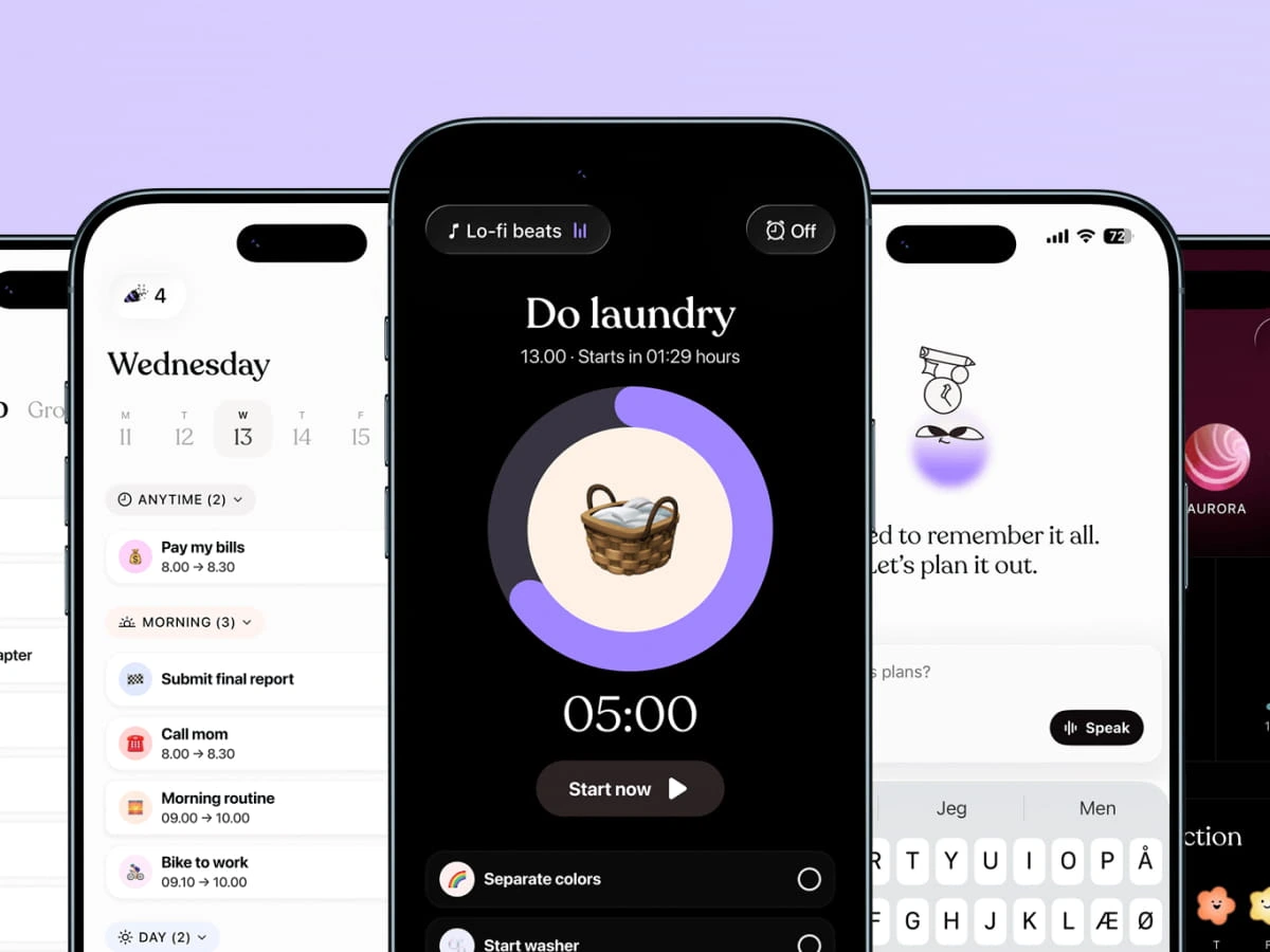
Tiimo is a visual daily planner built for people who experience time and tasks differently. Designed with neurodivergent users at its heart, including those with ADHD and autism, the app transforms the overwhelm of everyday structure into something manageable, even enjoyable.
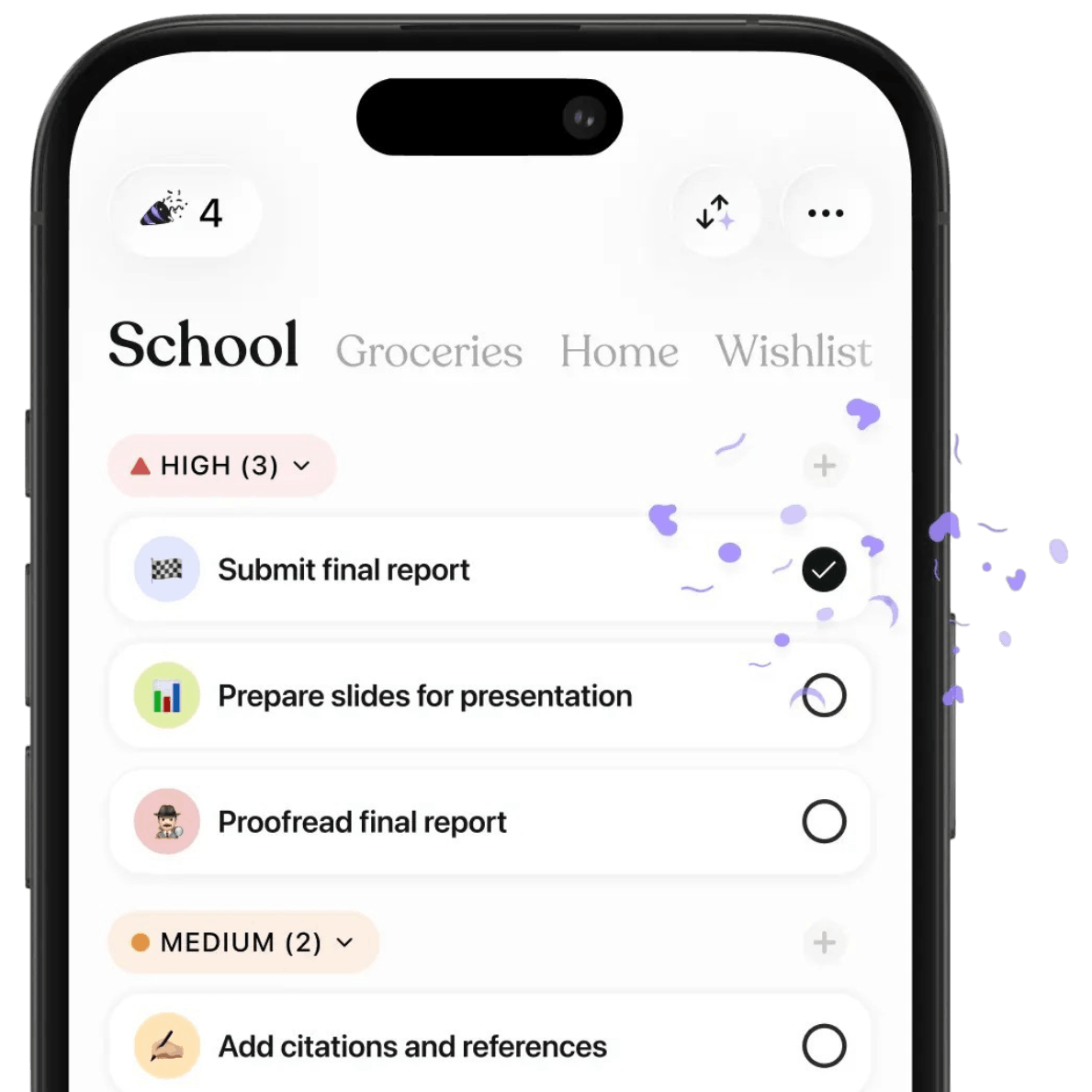
Working on the sonic identity for Tiimo was a meaningful and creatively stimulating opportunity. The challenge of giving an already deeply considered and community-loved product a true sonic voice pushed us to think carefully about every decision. When a product carries this much trust from its users, sound has to earn its place, and that responsibility makes the work all the more engaging to explore.
We developed a warm, friendly audio logo and UI sound suite designed to give Tiimo’s beloved character a distinct voice and support users seamlessly through their daily routines.
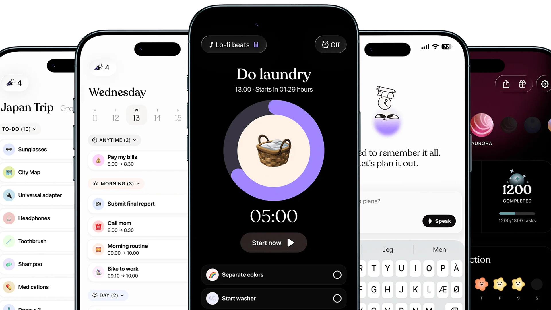
The core challenge in crafting a sonic identity for Tiimo was creating something that could feel genuinely distinct in a space where UI sounds are often forgettable or, worse, disruptive. For Tiimo’s users, sound isn’t just decoration. It’s part of how they experience transitions, task completions, and the rhythm of their day.
The sounds needed to feel immediately intuitive and unobtrusive, while still carrying enough personality to reinforce the warmth and playfulness that defines the Tiimo brand. Finding that balance, familiar enough to feel safe and distinctive enough to feel like Tiimo, was the creative tension at the heart of this project.
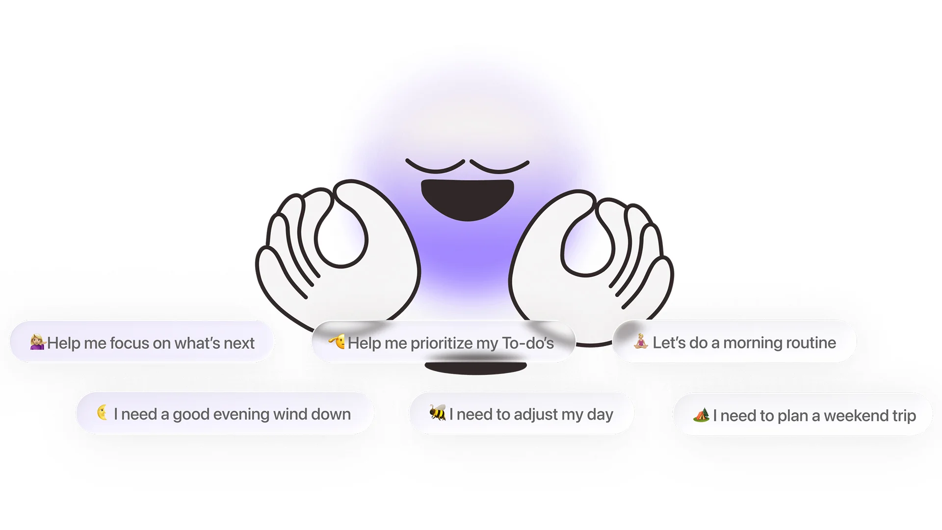
At the centre of Tiimo’s Audio Identity was the idea of giving the small purple Tiimo character an audible presence, a sonic personality that could accompany users through their day in the same way the visual character does.
From this foundation, we developed a sonic strategy built around three guiding qualities: playful, intuitive, and engaging. Tiimo’s role is to make everyday tasks feel manageable and even rewarding, so a core principle was to lean into a gamified sensibility, sounds that acknowledge effort, mark progress, and subtly encourage the user forward. This came to life through a signature palette of rounded, bubbly pops and twinkly chimes, grounded by short, friendly melodies and warm major harmonies that feel easy and reassuring to the ear.
Audio logo
The audio logo serves as the central anchor of Tiimo’s sonic universe – a short, uplifting melody that immediately communicates the warmth, safety, and encouragement of the brand.
UI sounds
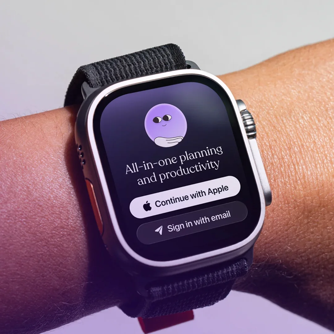
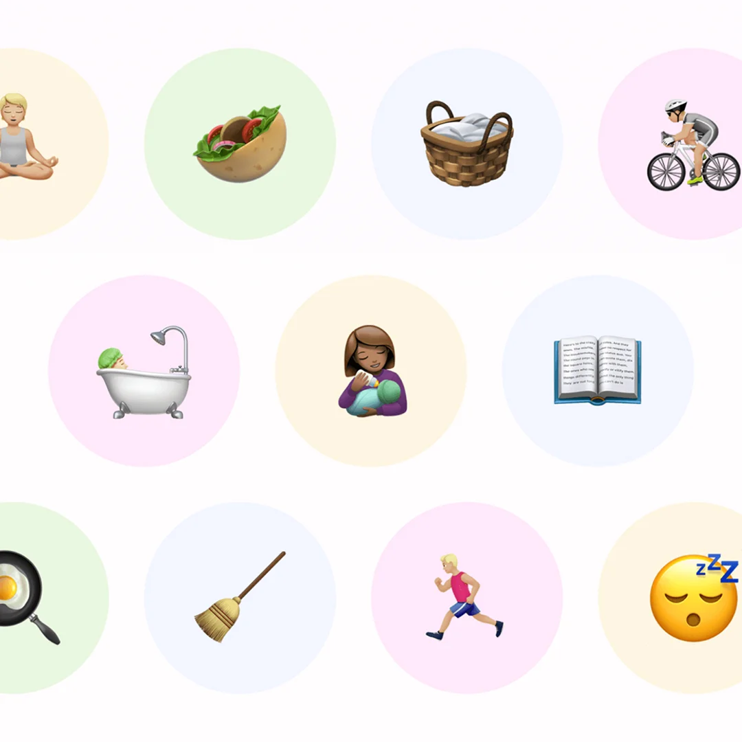
By transforming daily interaction cues into rewarding, warm auditory touchpoints, Tiimo now provides its neurodivergent community with an even more accessible and comforting digital environment. The tailored UX sound suite seamlessly integrates with Tiimo’s beloved visual character, establishing a cohesive and memorable brand identity that reinforces focus, confidence, and daily accomplishment. Learn more about the Tiimo app on their website.

Melissa Würtz Azari, Helene Lassen Nørlem & Anders Pape
Founders & Head of Design
Tiimo
Dividandy
Audio Identity | Audio Logo | UX Sound Design
Papara
Audio Identity | Audio Logo | Music | UX Sound Design | Voice

NEO
Audio Identity | Audio Logo

DSB App
UX Sound Design
Tiimo
Audio Identity | Audio Logo | UX Sound Design

ASUS
Audio Identity | Audio Logo | Music
OPPO
Audio Identity | Music | UX Sound Design
